Recently I blogged about VSauce’s guide to “what the world really looks like.” Something I didn’t touch on yet is that every map of the world necessarily twists things because they try to make a round world flat. The most common map projection distorts the world so badly that relatively tiny Greenland looks like it’s the same size as the whole continent of Africa.

Here, a silhouette of Mexico is moved north and distorted as much as Greenland is, while Greenland is moved as far south as Mexico. Moving Australia just a little to the south makes it almost unrecognizable. You can play around with the way the Mercator projection distorts things here.
If a human head was distorted the way the Mercator map is distorted, it would look pretty weird.
A graphic artist named Eric Testroete made himself an awesome Halloween costume a few years ago: A 3-D image of own head, made unnaturally huge.

Eric Testroete is an amazing artist.
Eric made a polygon map of his own head, the same way Robert Buckminster Fuller made his “Dymaxion Map” out of polygons. The Dymaxion Map is famous for minimizing distortion of the shapes and sizes of the continents:

The landmasses are distorted as little as possible. But doing the same thing with a human head shows how weirdly changed they really are:

Eewww.
Every map of the world you’ve ever seen is at least as bizarrely distorted as this. Weird as that is, the sizes are less distorted than the Mercator projection.

Eewww.
From now on, my reaction to every world map is: Man, that is so gross.
National Geographic now uses the “Winkel tripel projection” because it’s the best compromise of distortions. Even the best projection is still all out of wack:
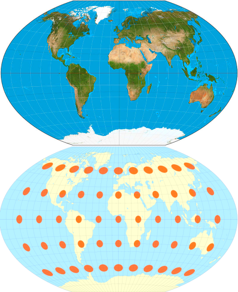
From Wikipedia
National Geographic has a one-minute guide to the weirdness of maps.
